Cruising Sailors Forum Archive
Hey Phil,
I know Billy Black pretty well, I have a huge amount of respect for the guy both professionally, and just as a really good guy... Billy has a long-standing relationship with CRUISING WORLD, a very sweet deal, he's far and away the closest thing they have to an "In House Photographer", and I'm guessing he feels awful about this happening...
Both magazines ran stories on the Morris 48 GT in their April issue, so it's not entirely coincidental they would have featured the boat on the cover... I'll bet Billy did that shoot on his own for Morris, probably as a buyout but with retaining some rights... The weather in Annapolis last fall when Billy shot the Boat of the Year nominees for CW was pretty crappy, so they went with the better stuff Billy had of the boat shot up in Maine... Probably not unlike what I used to do when working with Marlboro and Leo Burnett. They paid handsomely for a buyout and full rights to my images, but in reality that only applied to the images I gave them... I was the only one who ever saw and edited everything I'd shoot, after all, and they'd always get the best stuff, but they wouldn't always get ALL my stuff... (grin)
But Morris Yachts, owning the rights to certain images, I'll bet that image that wound up on the cover of SAIL - although it was credited to Billy - was one of those deals provided "courtesy of Morris Yachts". All the rags do that from time to time, photos "Courtesy of..." Beneteau, The Moorings, and so on... in this case, it would have sounded less like an advertorial if the photo credit went to the photographer, instead of the boat builder...
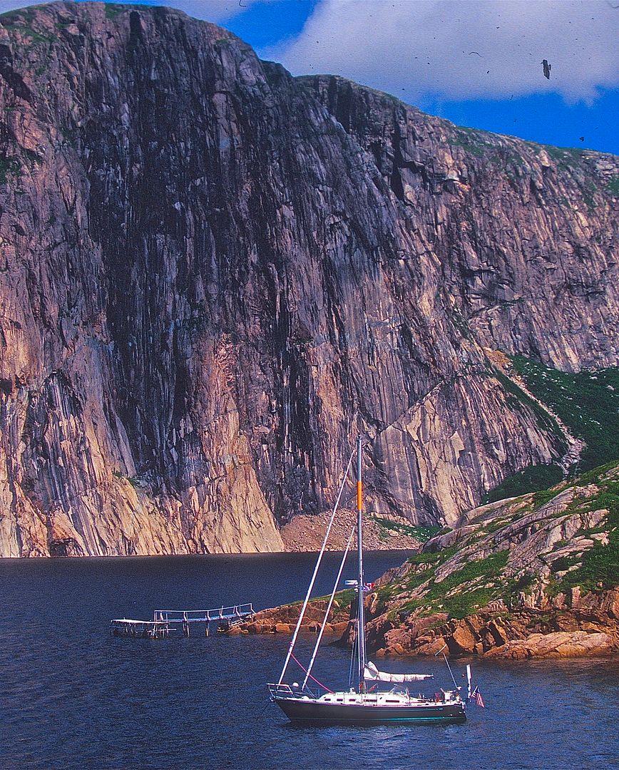
Coincidentally, I got a request from CW a couple of weeks ago, they were looking for a cover shot from Newfoundland for an upcoming issue... I have some nice stuff, but it's virtually all horizontal format, and with the boat relatively small compared to the surroundings... The pic below was about the best I could come up with, cropped for the cover format. I thought it would work pretty well as far as being able to overlay all the text they're putting on covers these days, and given the fact that Newfoundland is fondly referred to as "The Rock" by most Canadians, seems to me the image would be pretty fitting... They could have wiped out that distracting dock in Photoshop, to clean it up a bit...
Mark Pillsbury loved the image, but I just got an email from him late today, the art guys in Florida decided to go "in another direction"... Oddly, the main reason cited was they would have had trouble with the cover text, which seems to me to be one of the strengths of that background...Seems to me a light colored text would jump right out against that backdrop, without detracting from the image. But, we're just photographers, what do we know about Art Direction, right? (grin)
Who knows, perhaps they found something featuring a new Jeanneau with cat-eye windows, instead... Or, if only I'd had my sail cover on, perhaps? (grin)
best regards,
Jon

Messages In This Thread
- Decades ago, Time and Newsweek almost put the same photo of Bruce Springsteen on their covers the same week.

- Editors heads may have rolled back then, eh?
- When I saw the mag on our kitchen counter this afternoon,
- That's what happens when mags get cheap.....
- Here's my guess as to what might have happened...

- Bingo. Another notch down.

- What would happen if CW or SAIL went high end($) and the other became a free publication?
- Here's my guess as to what might have happened...